Zum Inhalt springen

Schlagwort: Data

Interaktive Karte von im zweiten Weltkrieg gesunkener Schiffe

Milde interessant: Sunken Ships of the Second World War ist eine Weltkarte, die Schiffe sammelt, welche im zweiten Weltkrieg versunken sind.

About the Sunken Ships of the Second World War

This dashboard maps out the locations of more than 15,227 ships that were sunk during the Second World War as a result of self-inflicted or enemy action (i.e. not included are ships sunk as a result of natural disasters or accidents). Data on another 4,787 ships was also collected but these are not mapped because of the lack of location data.

Location data may not be exact. This information is sometimes a generalized location (e.g. 50W, 42N) or a best guess. There are undoubtedly errors in the data.

Da geht der dahin, der Urlaubstag.


(via BoingBoing)

Einen Kommentar hinterlassen

Music from computer tape – behind the sound of data

Die meisten kennen wahrscheinlich noch die Sounds, die Datasetten beim Laden von sich gaben und die so gar nichts mit Musik zu tun hatten. A Last Picture From Voyager dürfte nicht der erste sein, der sie samplet, um daraus Musik zu machen, aber ich mag die Art, wie er seine Videos gestaltet – und den Sound mag ich auch.

I found old computer tapes from my wife’s grandfather. He used these tapes to calculate area, lenghts, prices … in houses construction mid / late 70’s. That was the time of computers using magnetic tapes to store informations. I was curious to listent to the sound of data, and if it was possible to make music with it.


(Direktlink)

Einen Kommentar hinterlassen

Von 3000 v. Chr. bis heute: Die bevölkerungsreichsten Städte der Welt

Nichts ist für immer, in allem ist Bewegung. Auch die Anziehungskräfte von verschiedensten Städten haben sich in den Jahrtausenden aufgrund diverser Einflüsse immer weider verändert und bleiben wahrscheinlich bis in die Zukunft ein dynamischer Prozess. Ollie Bye hat das mit ihm zur Verfügung stehenden Daten mal visualisiert. Irgendwie spannend.


(Direktlink, via Kottke)

Einen Kommentar hinterlassen

Weltbahnkarte

Normalerweise sieht man eine Eisenbahnkarte ja eher aus einer lokalen Perspektive, denn sie soll zeigen, wie man von fix Punkt A nach Punkt B kommt. Als Lernexperiment kartierte Zhaoxu Sui die wichtigsten Eisenbahnstrecken weltweit. Diese ist nicht vollständig und zeigt nur die „wichtigsten“ Verbindungen, wobei die allerwichtigste ja immer die ist, die man selber gerade benötigt. Immerhin aber kann man so sehen, wie man von Europa nach China kommt, was ich tatsächlich gerne mal mit der Bahn fahren wollen würde.

1.This map only shows major passenger rails in the World. However, in US, Australia, and some other parts, the map could be more detailed as trains would be depicted.

2.This is the beta version, which means a lot of errors and mistakes could be on the map, please give me corrections and suggestions so that I can improve.


(via Messy Nessy)

Einen Kommentar hinterlassen

Interaktive Karte zeigt mittelalterliche Mordfälle in London, York, und Oxford

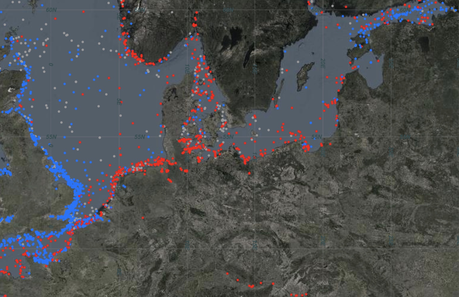
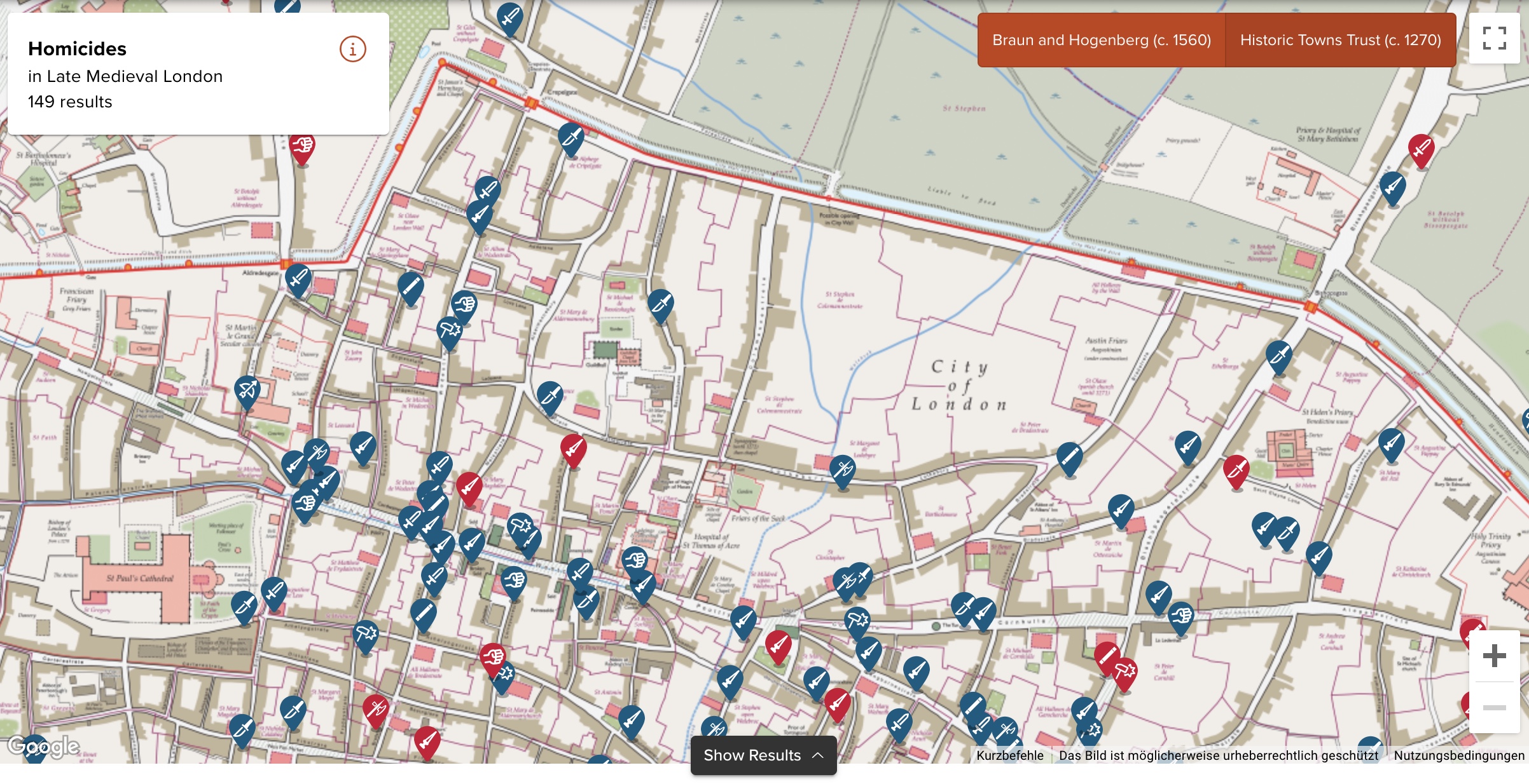
Die University of Cambridge hat eine interaktive Karte im Netz, die die im Mittelalter statt gefundenen Morde und dazugehörige Hintergrundinformationen in London, York, und Oxford zeigt. Ich weiß gar nicht, was genau die Karte für mich so interessant macht, aber ich klicke da jetzt trotzdem schon eine Weile drin rum.

In the first half of the fourteenth century, London was a bustling metropolis. The population of 80-100,000 people mostly lived within the City Walls, with 7 main gates, 25 wards, and about 110 parishes. Along the Thames, the wharfs and markets saw merchants from Flanders and the Hanse Cities, and the area around Poultry and Bank was home to a large financial industry with bankers from Florence and elsewhere. Markets around Bishopsgate, along Cheapside offered fish, meat, milk, bread and other daily goods. London was also famous for its luxury goods, especially gold, clothes, shoes, spices, weapons and jewellery. Powerful guilds such as the tailors, fishmongers, bakers, and cordwainers dominated local politics, controlled prices, and gave a sense of identity to young people as apprentices. Religious houses were scattered across the city, and St Paul’s Cathedral with its massive spire dominated the skyline.

London coroners’ rolls have survived for nine years between 1300 and 1340. The texts report the findings of the investigative jury. They were summoned when a suspicious, sudden and violent death had occurred. Although the details vary, the summary would usually specify where and when the homicide happened, who was involved, what triggered the event, what weapons were used, and what the nature and dimensions of the wound were.


(via MeFi)

Einen Kommentar hinterlassen

Karte zeigt die Länder der Welt, in denen man Leitungswasser trinken kann

Wasser aus dem Hahn zu trinken ist für die meisten von uns wahrscheinlich absolute Normalität. Damit allerdings gehören wir zu ziemlich wenigen privilegierten Nationen auf diesem Planeten, wie diese Karte zeigt. Woanders nämlich ist das alles andere als selbstverständlich und nicht mal möglich.

(Grafik: QS SuppliesCC BY-SA 4.0, via Kottke)
6 Kommentare

Bird Migration Explorer

Sehr schön gestalteter Data-Porn beim Bird Migration Explorer der National Audubon Society. Eine interaktive Karte der westlichen Hemisphäre, die die saisonalen Migrationsmuster von mehr als 450 Vogelarten zeigt.

The Bird Migration Explorer captures the joy of birds and the wonder of migration through a series of interactive maps built using the latest and best-available migration and conservation science.

Using this unique digital platform, visitors to the Bird Migration Explorer can learn about the full annual cycle for 458 species of migratory birds that regularly breed in the United States and Canada and use areas in Latin America and the Caribbean during other times of the year.


(via Kottke)

Einen Kommentar hinterlassen

Interaktive Karte zeigt, wo zukünftig wohl gekifft werden darf

„Cannabislegalisierung“ klang im Koalitionsvertrag ja erst mal ganz gut, wurde dann aber ganz schön herunter gebrochen und erweist sich als weniger frei als gedacht, was ja auch egal ist. Denn: wer bisher irgendwo kiffen wollte, hat das im Regelfall eh getan. Vielleicht nicht dirket vor der nächsten Wache, aber ansonsten hat sich da kaum einer drum geschert. Sei es drum, und mir ist es eh egal, weil ich aus dem Game raus bin, diese interaktive Karte zeigt, wo zukünftig wohl gekifft werden darf. Und wenn es bei euch nicht passen sollte, lade ich euch (nicht alle auf einmal) gerne in meinen Garten ein, hier darf man dann nämlich. So als ganz kleiner Fleck in Potsdam Nord.

Die Ampel-Koalition will Cannabis legalisieren. Allerdings darf auch dann nicht einfach überall in der Öffentlichkeit gekifft werden. Die Karte zeigt, welche Verbotszonen sich aus dem Gesetzentwurf ergeben.

4 Kommentare