Das Universelle S, auch Cooles S bzw. engl. Universal S oder Cool S, ist ein Graffiti-Zeichen aus der Popkultur und der Kinderliteratur, das typischerweise in Kinderhefte gekritzelt oder an Wände gesprüht wird. Der genaue Ursprung des Cool S ist unbekannt, aber es wurde Anfang der 1980er-Jahre als Teil der Graffiti-Kultur populär. Und ich glaube immer noch fest daran, dass das S eines der beliebtesten Graffiti-Buchstaben ist.
Geschichte
Die genaue Herkunft des Universellen S ist unbekannt. Die derzeit älteste bekannte Version des Symbols stammt von einem Foto aus dem Jahr 1973, welches 1974 in einem Buch von dem amerikanischen Agenten und Star-Fotografen Jon Naar veröffentlicht wurde. Aufgrund dieser Tatsache wird davon ausgegangen, dass das Symbol vermutlich aus der Straßenkunstszene des New York der 1970er-Jahre stammt.Zur Verbreitung des Symbols trug auch wesentlich der amerikanische Künstler Jean-Michel Basquiat bei, der das Zeichen in vielen seiner Werke aus den 1980er-Jahren verwendete.
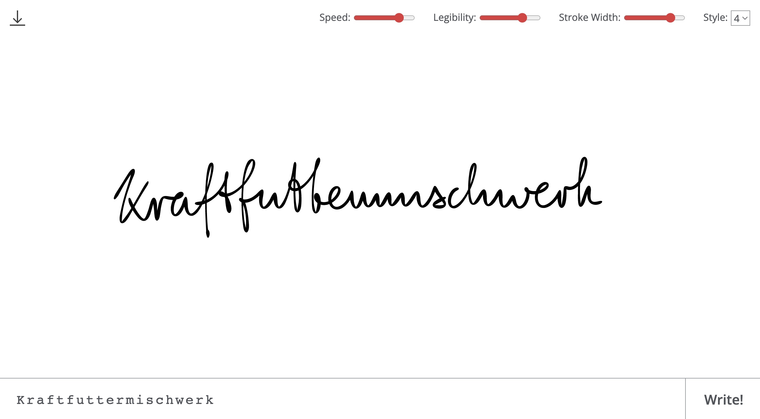
(Direktlink, via TYWKIWDBI)