Unvorhersehbar und dennoch interessant womit sich manche so auseinandersetzen. In dem Fall, wie im Guardian seziert, geht es um Schrifttrends der Gentrifizierung. Konkreter um den Font Neutraface und die Design-Marketing-Ästhetik der Gentrifizierung. Wäre ich nie drauf gekommen, aber irgendwie hängt ja doch alles zusammen.
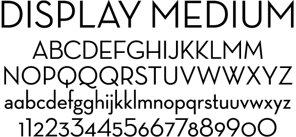
Neutraface – a typeface known for its clean lines and its legibility from a distance – has been dubbed the unofficial font of gentrification, according to eagle-eyed Twitter and Instagram users who have spotted the typeface (and others like it) on buildings around the country.
[…]
For many of these professionals and tastemakers, the minimalism of Neutraface – with its thin, pointy, attention-grabbing lines – adds whimsy and elegance to a building. At the same time, as Neutraface house numbers have become too commonplace to ignore, some now associate them (along with gray paint jobs) with neighborhoods overtaken by construction and renovations.
That association also lends itself to other dystopian connections: cheap fixer-upper jobs done on the fly, rent hikes and people being displaced from their longtime homes. Whatever the meanings people make of these house numbers, Neutraface now seems both indivisible from – and an indicator of – the constant changes of our nation’s screwed-up housing market.
(via BoingBoing)