Zum Inhalt springen

Schlagwort: Design

50 Manga Chairs

Nendo mit einer kurzweiligen Darstellung von 50 verschiedenen Stuhl-Designs, animiert im Manga Stil.

„50 manga chairs is the result of adapting the strong symbolic nature of manga comics to furniture design.
„Manga consists of a series of frames on a single sheet of paper that creates a sequence. Similarly, 50 standard chairs are lined up in a grid, each one conjures up a sense of story, and each with a design element from manga. For example, a ’speech bubble‘ or ‚effect line‘ are added to visualize sound or action. Or emotional symbols from manga, like ’sweat‘ or ‚tears‘, are formed so that a sense of story and character can be felt.
„Manga is a means of expression with a high degree of flatness and abstraction, and which is composed of a series of lines. We could say that manga comics are deeply rooted in Japanese culture, since they can be traced back to Ukiyoe prints developed during the Edo period (1603-1868 A.D.).“


(via Core77)

Einen Kommentar hinterlassen

Eine Sammlung alter Plattenlabel-Logos

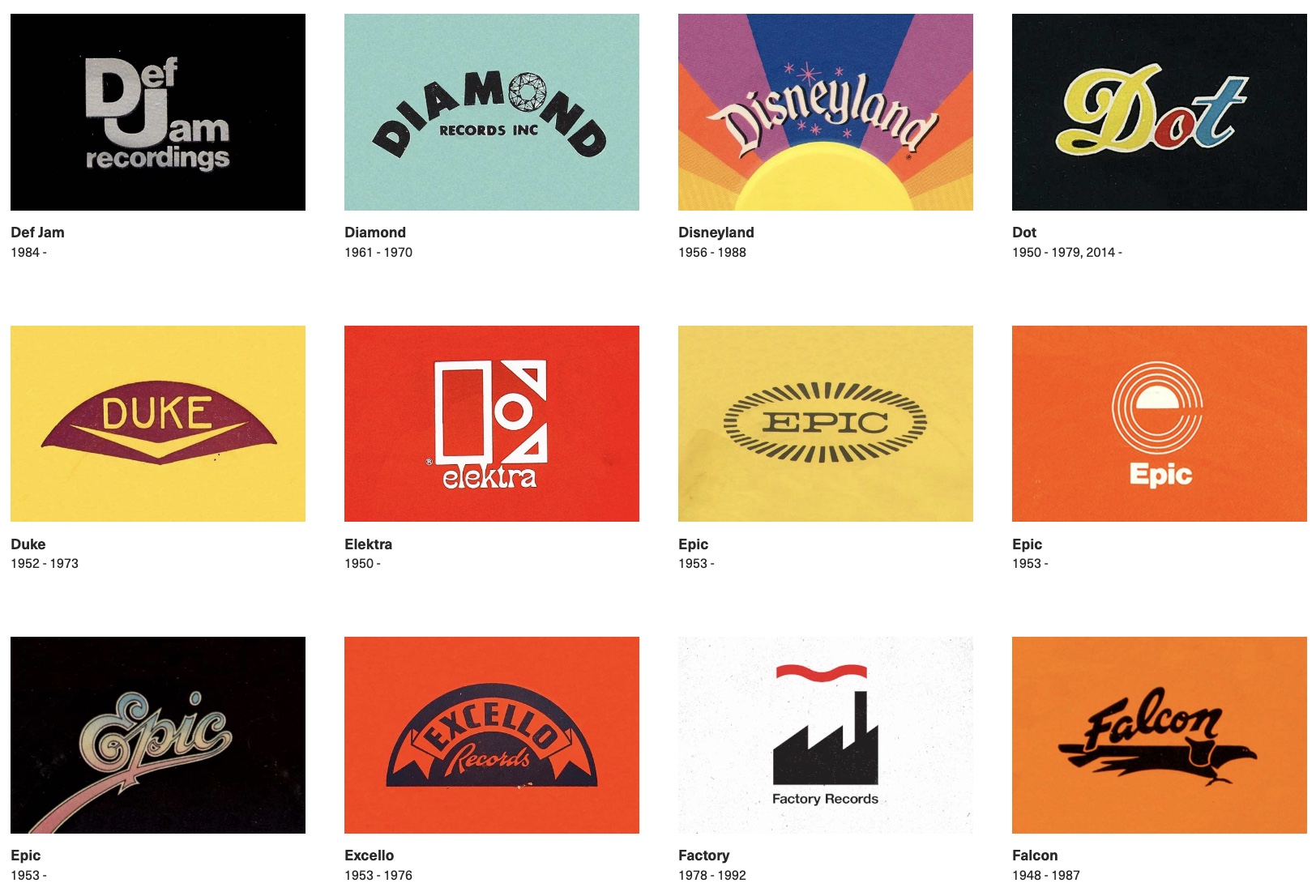
Der Designer und Illustrator Reagan Ray hat sich die Mühe gemacht und jede Menge Logos von alten und auch noch existierenden Plattenfirmen zusammengesammelt. Und ich mag das Wort „Plattenlabel-Logos“ sehr gerne.

This was a beast of a post to put together. In my other logo posts, I was dealing with hundreds of brands. With record labels, it’s in the thousands. If you include indie and foreign labels, I feel like I could have spent the next few years trying to track down and organize all the label logos out there. Halfway through, I almost decided to split it up by either decade or genre, but it was just too daunting.


(via Messy Nessy)

Ein Kommentar

Kickstarter-Kampagne für ein Buch über die Kunst von Bandlogos

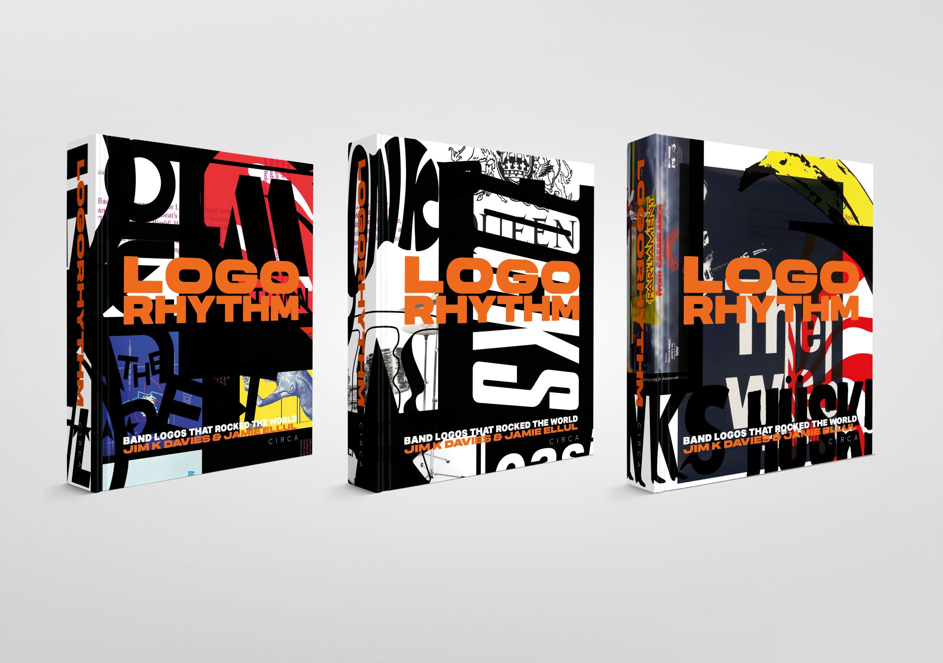
Nicht wenige Logos diverser Bands sind so individuell und ikonisch wie ihr Sound es auch ist und gehören im Regelfall zum Gesamtkonzept der Band. Für das Buch Logo Rhythm hat man nicht wenige Designs von Bandlogos und ihre Geschichten genauer unter die Lupe genommen und sammelt sie in einem 440 Seiten starken Buch. Hier die Kickstarter Kampagne, die bereits durchfinanziert ist. In meinen Augen ein perfektes Geschenk.

(Direktlink, via Kottke)

Einen Kommentar hinterlassen

KI Synthesizer „Spin“

Wie ich finde ziemlich abgefahrenes Projekt von Arvind Sanjeev, der vorgibt mit „Spin“ einen Synthesizer entwickelt zu haben, der auf KI Basis Musik ausspuckt, mit einer Art Plattenspieler scratchbar ist und zu dem auch noch gut aussieht.

SPIN is an AI music synthesizer that allows you to co-create compositions with a language model, MusicGen. It is a playful invitation to explore the nuances of algorithmic music, encouraging you to slow down and zoom in on its artifacts. It celebrates the marriage between human and machine creativity through music.

SPIN breaks down the process of co-composing music with an AI using a tangible interface. Enter the desired mood, genre, sounds and bpm to listen to the music come alive on an LP record. A DVS (Digital Vinyl System) allows you to slow down, zoom in, scratch and listen between the notes. Use it to create new compositions, as a simple sound synthesizer, as a playful scratch tool, or to play relaxing music in the background.

(Direktlink, via Yanko Design)

Ein Kommentar

Rosita Stereo Commander Luxus

Sehr hübsche Kompaktanlage von Rosita aus den 1970er Jahren. Keine Ahnung, wie gut die heute noch klingt, aber optisch ein echtes Highlight, das mittlerweile auch richtig teuer ist, wie ich gerade feststellen konnte.

Besonders geil dann in Kombination mit den Grundig Audiorama Kugelboxen.


(Direktlink)


(Direktlink)

Ein Kommentar

Schrifttrends der Gentrifizierung

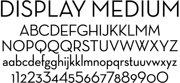
Unvorhersehbar und dennoch interessant womit sich manche so auseinandersetzen. In dem Fall, wie im Guardian seziert, geht es um Schrifttrends der Gentrifizierung. Konkreter um den Font Neutraface und die Design-Marketing-Ästhetik der Gentrifizierung. Wäre ich nie drauf gekommen, aber irgendwie hängt ja doch alles zusammen.

Neutraface – a typeface known for its clean lines and its legibility from a distance – has been dubbed the unofficial font of gentrification, according to eagle-eyed Twitter and Instagram users who have spotted the typeface (and others like it) on buildings around the country.

[…]

For many of these professionals and tastemakers, the minimalism of Neutraface – with its thin, pointy, attention-grabbing lines – adds whimsy and elegance to a building. At the same time, as Neutraface house numbers have become too commonplace to ignore, some now associate them (along with gray paint jobs) with neighborhoods overtaken by construction and renovations.

That association also lends itself to other dystopian connections: cheap fixer-upper jobs done on the fly, rent hikes and people being displaced from their longtime homes. Whatever the meanings people make of these house numbers, Neutraface now seems both indivisible from – and an indicator of – the constant changes of our nation’s screwed-up housing market.

(via BoingBoing)

Einen Kommentar hinterlassen

Interaktive Schneekugel-Uhr

Natürlich nicht mit echtem Schnee, sondern Styroporkörnern und dennoch recht hübsch anzuschauen und zu stürmig verwedeln: die Schneekugel Uhr von Baek Sunwoo, Kim Myeongseong und Prof. Lee Woohun aus Südkorea.

Time to Snow is an interactive installation that displays the current time using tiny Styrofoam grains that resemble snow. The installation emphasises the aesthetic allure and ephemeral nature of snow in an immersive and magical experience. The title not only evokes “displaying time with snow”, but also serves as a double entendre to the enchanting moment when it snows. Time to Snow simulates the experience of interacting with real snow, and viewers are invited to interact playfully with the polystyrene grains using hand gestures.

(Direktlink, via

4 Kommentare