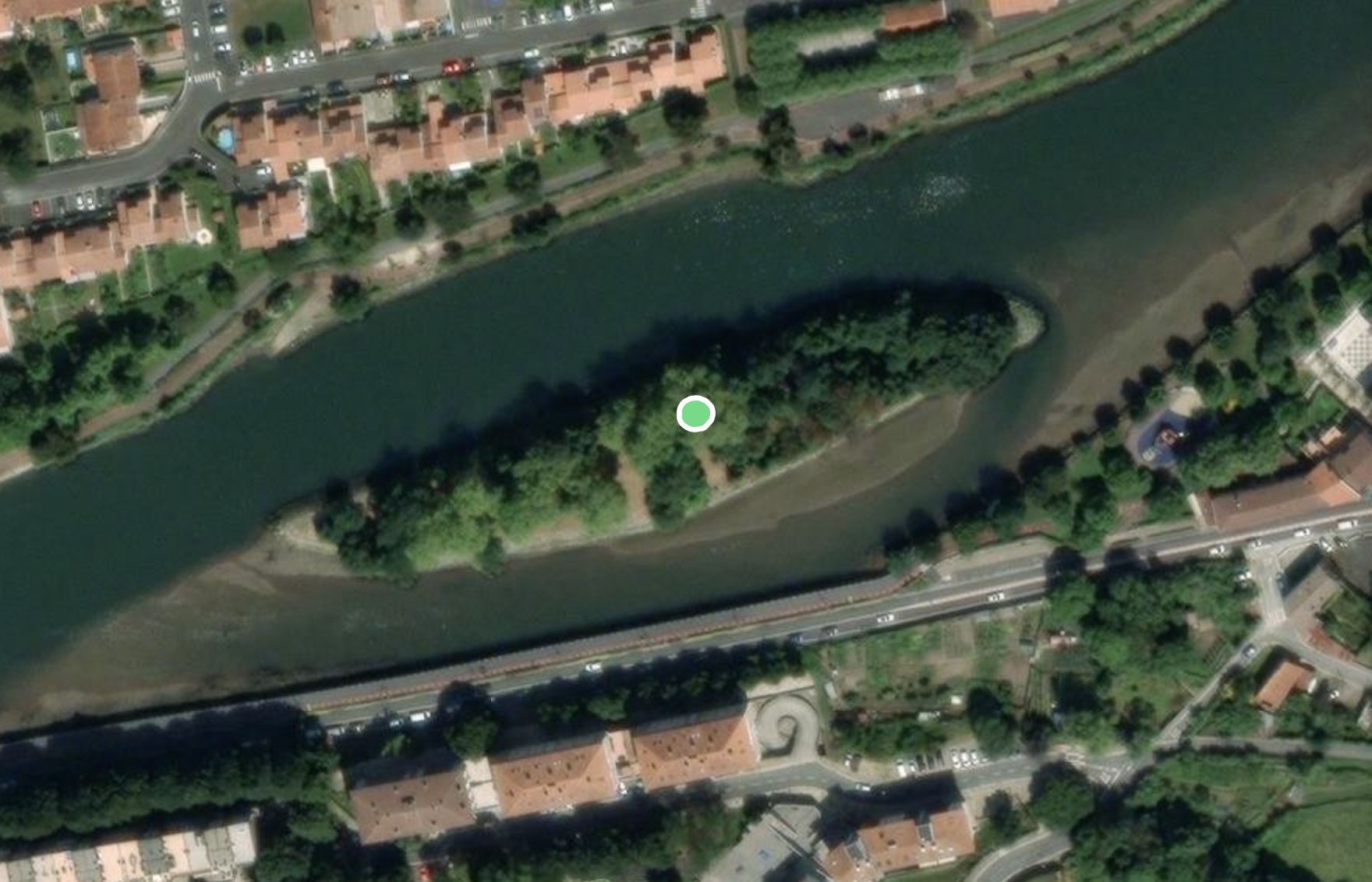
Zum Inhalt springen

Schlagwort: Data

Interaktive Karte zeigt mittelalterliche Mordfälle in London, York, und Oxford

Die University of Cambridge hat eine interaktive Karte im Netz, die die im Mittelalter statt gefundenen Morde und dazugehörige Hintergrundinformationen in London, York, und Oxford zeigt. Ich weiß gar nicht, was genau die Karte für mich so interessant macht, aber ich klicke da jetzt trotzdem schon eine Weile drin rum.

In the first half of the fourteenth century, London was a bustling metropolis. The population of 80-100,000 people mostly lived within the City Walls, with 7 main gates, 25 wards, and about 110 parishes. Along the Thames, the wharfs and markets saw merchants from Flanders and the Hanse Cities, and the area around Poultry and Bank was home to a large financial industry with bankers from Florence and elsewhere. Markets around Bishopsgate, along Cheapside offered fish, meat, milk, bread and other daily goods. London was also famous for its luxury goods, especially gold, clothes, shoes, spices, weapons and jewellery. Powerful guilds such as the tailors, fishmongers, bakers, and cordwainers dominated local politics, controlled prices, and gave a sense of identity to young people as apprentices. Religious houses were scattered across the city, and St Paul’s Cathedral with its massive spire dominated the skyline.

London coroners’ rolls have survived for nine years between 1300 and 1340. The texts report the findings of the investigative jury. They were summoned when a suspicious, sudden and violent death had occurred. Although the details vary, the summary would usually specify where and when the homicide happened, who was involved, what triggered the event, what weapons were used, and what the nature and dimensions of the wound were.


(via MeFi)

Einen Kommentar hinterlassen

Bird Migration Explorer

Sehr schön gestalteter Data-Porn beim Bird Migration Explorer der National Audubon Society. Eine interaktive Karte der westlichen Hemisphäre, die die saisonalen Migrationsmuster von mehr als 450 Vogelarten zeigt.

The Bird Migration Explorer captures the joy of birds and the wonder of migration through a series of interactive maps built using the latest and best-available migration and conservation science.

Using this unique digital platform, visitors to the Bird Migration Explorer can learn about the full annual cycle for 458 species of migratory birds that regularly breed in the United States and Canada and use areas in Latin America and the Caribbean during other times of the year.


(via Kottke)

Einen Kommentar hinterlassen

Interaktive Karte zeigt, wo zukünftig wohl gekifft werden darf

„Cannabislegalisierung“ klang im Koalitionsvertrag ja erst mal ganz gut, wurde dann aber ganz schön herunter gebrochen und erweist sich als weniger frei als gedacht, was ja auch egal ist. Denn: wer bisher irgendwo kiffen wollte, hat das im Regelfall eh getan. Vielleicht nicht dirket vor der nächsten Wache, aber ansonsten hat sich da kaum einer drum geschert. Sei es drum, und mir ist es eh egal, weil ich aus dem Game raus bin, diese interaktive Karte zeigt, wo zukünftig wohl gekifft werden darf. Und wenn es bei euch nicht passen sollte, lade ich euch (nicht alle auf einmal) gerne in meinen Garten ein, hier darf man dann nämlich. So als ganz kleiner Fleck in Potsdam Nord.

Die Ampel-Koalition will Cannabis legalisieren. Allerdings darf auch dann nicht einfach überall in der Öffentlichkeit gekifft werden. Die Karte zeigt, welche Verbotszonen sich aus dem Gesetzentwurf ergeben.

4 Kommentare

Eine Kamera, die anhand von Standortdaten Fotos ohne Objektiv generiert

Die Paragraphica ist eine von Bjoern Karmann entwickelte „Kamera“, die eigentlich nicht wirklich eine ist, da sie kein Objektiv besitz. Die gemachten Fotos werden aus Standortdaten mittels KI generiert. Fotografisch romantisch ist das freilich nicht, aber dass das technisch ermöglicht wurde, ist imho schon so nerdy wie beeindruckend.

Einen Kommentar hinterlassen

Die meist genutzten Social-Media-Netzwerke von 2003 bis 2022

Data Is Beautiful mit einer animierten Zeitleiste, die die beliebtesten Social-Media-Netzwerke zwischen den Jahren 2003 und 2022 in chronologischer Reihenfolge nach Quartalen zeigt. Ich habe in dem Zuge mal geguckt, ob ich mein altes Myspace Profil noch finden kann, aber das habe ich offenbar mal gelöscht. Dass ich bei so gut wie allen aktuell „angesagten“ Netzwerken einen Account habe, irritiert mich ein wenig, wobei ich einige davon überhaupt nicht nutze.


(Direktlink, via Laughing Squid)

Einen Kommentar hinterlassen