Kurzer und wie ich finde praktischer Reiseservice: auf direkt.bahn.guru kann man sich anzeigen lassen, welche Bahnverbindungen von einem ausgewählten Bahnhof direkt mit einem Zug benutzbar sind und an welches Ziel sie führen. Von Potsdam aus sähe das so aus. Da geht aus anderen Großstädten sicher mehr.
Aber ein anderer (Regional)Bahnhof, den ich mehrfach die Woche nutze, hat noch deutlich weniger zu bieten.
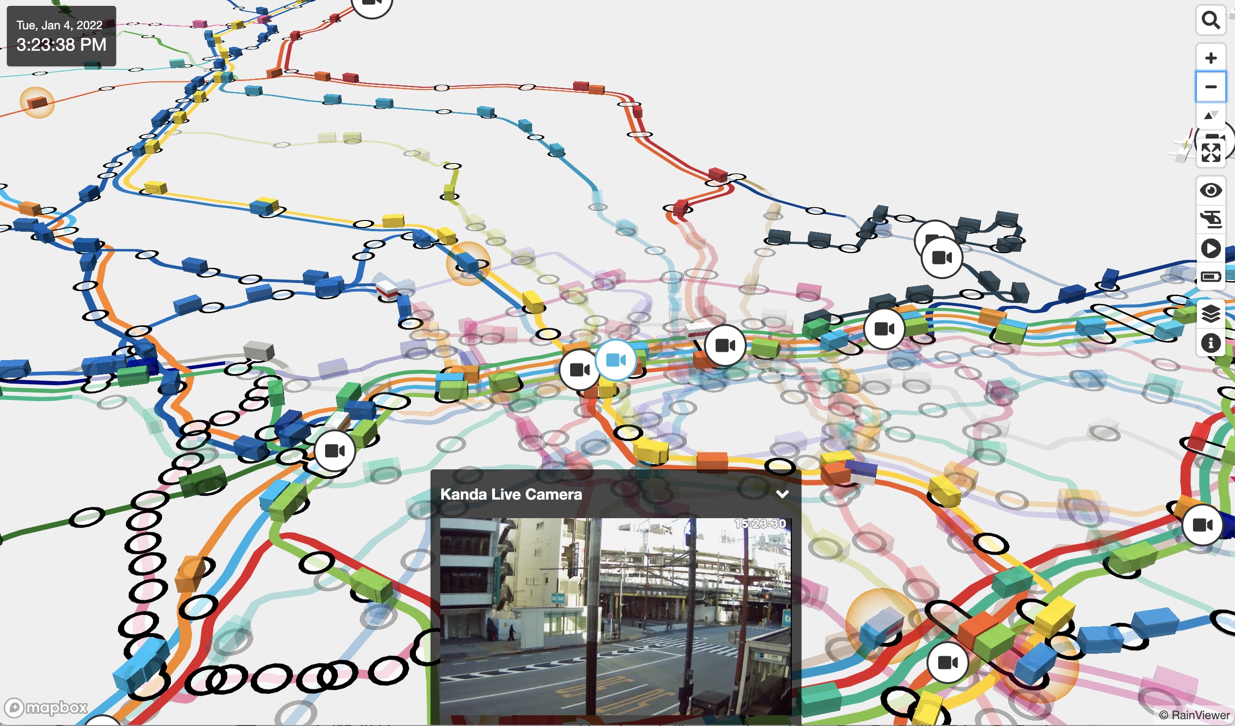
Wer mal eben live gucken mag, was auf den Schienen Tokios los ist, dem sei Mini Tokyo 3D empfohlen, wo sich die Schienenbewegungen in Echtzeit und per Live-Cams einsehen lassen. Ein digitaler Spiegel dessen, was dort gerade passiert und deshalb ziemlich cool.
„Mini Tokyo 3D is a real-time 3D map of public transportation in Tokyo. Trains in operation and airplanes that are arriving or departing are represented on a realistic 3D map with smooth animation. This is a “digital twin” that looks exactly like the real world in the digital world.“ From Akihiko Kusanagi aka nagix [github].
Joseph Pisenti bietet hier einen „kurzen Überblick“ über die längste Strecke, die man auf der Erde zwischen zwei Punkten zu Fuß zurücklegen könnte. Dafür müssten geneigte Wandernde in L’Agulhas, Südafrika, starten und bis Magadan in Russland laufen. Das sind über 20.000 Kilometer. Es würde wohl drei Jahre dauern, die Strecke hinter sich zu bringen und man hätte wahrscheinlich jede Menge Stress bei den vielen Grenzüberquerungen. Wohl nur einer der Gründe, warum sich das bisher wohl noch keiner gegeben hat.
Nobody in history has ever before managed to complete this real-life achievement. People have already climbed the tallest mountain, sunk to the deepest part of the ocean and even landed on the moon, but nobody has ever accomplished the longest possible walk. So what would it actually be like for you if you decided to become the first. Here is a brief overview of both the horrible and amazing things that you would end up experiencing.
Ich weiß nicht genau, wo diese Karte herkommt, aber sie hat so ziemlich alles an Bord, was meine Biografie ausmacht. Auch den Schmott darin. Aber: das alles hätte so offenbar auch auf der Insel Rügen stattfinden können, verdammt.
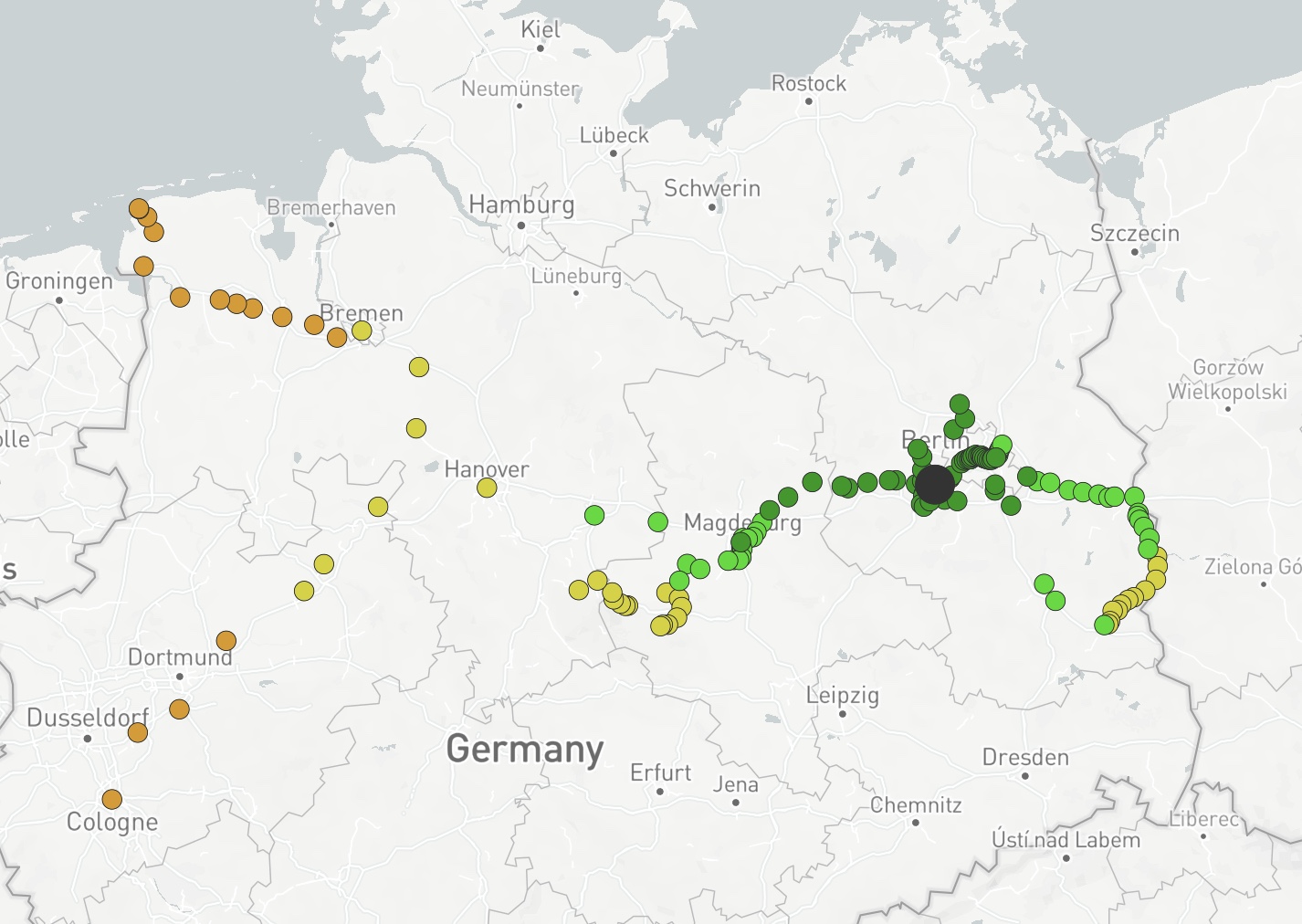
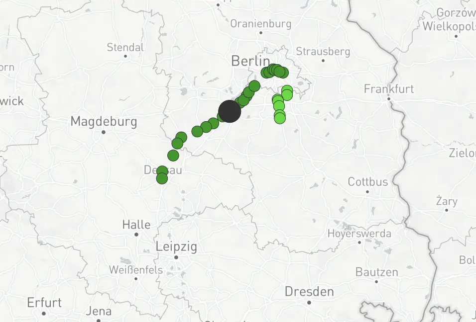
Der aktuelle, offizielle Linienplan der Schienenverbindungen von Berlin ist 27 Jahre alt, mittlerweile etwas unübersichtlich und auch nicht sonderlich schön. Der Designer Pasha Omelekhin hat sich daran gemacht, den Plan neu und angemessen zu gestalten, was ihm wirklich außerordentlich gut gelungen ist. Und mir war nicht klar, dass die Ringbahn in Berlin in Form eines Hundekopfes im Kreis fährt. Dieser ist hier wieder deutlich zu erkennen. Die Geschichte der Kartierung des Berliner Liniennetzes und seine Vorgehensweise erklärt Pasha ausführlich auf Berlin Transit Map. Das hier ist seine aktuelle Karte:
The previous transit map was designed 27 years ago. Since that time, quite a lot of stations have appeared, and the map has got out of style and become too complicated. Nearly three million people a day use Berlin commuter rail and U-Bahn (subway), one can’t just put a blind eye on it. It is obvious that the map needs updating.
[…]
The lines are drawn in a way that allows to find the required station and build a route as easy as possible. Owing to large rounded angles and small quantity of turns, eyes can easier monitor the route.
Die Karte gibt es hier zum Download, hier zum Ausdrucken und als Poster. Vielleicht bequemt sich Berlin ja und macht die Karte zu einer offiziellen. Das wäre doch mal was.
Immer wieder erstaunlich, wenn man sich vor Augen hält, wie jung die Metropole aller Metropolen im Vergleich zu all den anderen aus ihrer Klasse ist. Hier das städtische Wachstum New Yorks in den letzten 413 Jahren.
This animation illustrates the development of NYC’s street grid and infrastructure systems from 1609 to the present-day, using geo-referenced road network data and historic maps. The resulting short film presents a series of “cartographic snapshots” of NYC’s built-up urban area at intervals of every 20-30 years history.
Schöne Recherchearbeit: Dieses Video zeigt Orte, die irgendwann mal in den Texten der Beatles erwähnt wurden. Von Liverpool über die Black Mountain Hills, von Dakota bis nach Moskau, wo die Balalaikas immer klingen.
Take yourself on a tour of lyric locations in The Beatles songs. From Eleanor Rigby’s gravestone in Liverpool to Abbey Road in North London, see the locations behind The Beatles lyrics throughout England, France, Russia, India, the United States, and more countries, covering 25,510 miles around the world.
Diese Website verwendet Cookies, damit wir dir die bestmögliche Benutzererfahrung bieten können. Cookie-Informationen werden in deinem Browser gespeichert und führen Funktionen aus, wie das Wiedererkennen von dir, wenn du auf unsere Website zurückkehrst, und hilft unserem Team zu verstehen, welche Abschnitte der Website für dich am interessantesten und nützlichsten sind.
Unbedingt notwendige Cookies
Unbedingt notwendige Cookies sollten jederzeit aktiviert sein, damit wir deine Einstellungen für die Cookie-Einstellungen speichern können.
Wenn du diesen Cookie deaktivierst, können wir die Einstellungen nicht speichern. Dies bedeutet, dass du jedes Mal, wenn du diese Website besuchst, die Cookies erneut aktivieren oder deaktivieren musst.


